Ever wonder what a mountain of raw data could reveal if you learned how to interpret its whispers and murmurs? Unlocking patterns is exactly about that — discovering the hidden stories that data holds but doesn’t shout out loud. It’s like following a trail of breadcrumbs, except the breadcrumbs are complex datasets, and the trail leads to insights that could transform businesses, science, or even everyday decision-making.
Think of data like detective work. Patterns are the clues; they hide in plain sight, camouflaged in numbers, strings, and metrics. By recognizing these breadcrumbs, you unearth valuable treasures of knowledge. Patterns hold the power to forecast trends, identify anomalies, and even explain behaviors. Sounds exciting, right? Let’s explore how you can make this work for you!
How Do You Begin to Spot Patterns?
First off, a curious mind is your biggest strength here. Patterns often emerge when you start asking simple but pointed questions like, “Why does sales spike on Fridays?” or “What do successful customers have in common?” These are the kinds of prompts that nudge the data to ‘talk.’
- Break It Down: Look at the data piece by piece instead of as a whole. By plotting and segmenting information into smaller chunks — say, by time periods or customer regions — you begin to see trends more clearly.
- Play with Visualizations: As much as raw numbers can be meaningful, scatter plots, heat maps, and line graphs often bring those hidden signals straight to the surface. More on that in another section!
- Watch for Outliers: Sometimes the weird, one-off data points tell the most interesting stories. Digging into them might help you uncover overlooked opportunities or flag potential issues.
The Role of Algorithms (But Don’t Let That Word Scare You!)
If the thought of math-heavy jargon makes you nervous, don’t worry. Today, there’s an arsenal of accessible tools that help even beginners find patterns. Machine learning tools like clustering and classification algorithms do a fantastic job of identifying data groups or categories that you might not immediately notice. But before you dive into these high-tech options, remember one key thing — always interpret your results mindfully. Algorithms are great helpers, but they work best when humans align them with critical thinking and domain knowledge.
Real-Life Wins from Pattern Decoding
Why does unlocking patterns matter? Because it’s the secret sauce behind some of the most groundbreaking innovations we see today. For example:
- A healthcare company identifies patterns in patient symptoms to predict diseases earlier.
- Online retailers uncover shopping trends and use them to recommend products customers didn’t even know they wanted.
- A city’s traffic management team deciphers road congestion patterns to make smarter decisions about infrastructure and signal timing.
These are just a few examples of how extracting patterns creates meaningful impact. When used responsibly, it’s not just about profits or efficiency; it’s about improving lives, solving complex challenges, and fostering innovation. Cool, right?
Data Cleanup: The Unsung Hero of Analysis
Let’s be honest, when you hear about data analysis, what crosses your mind? Is it exciting discoveries, dazzling visualizations, or powerful predictions? Most people focus on the outcome, the shiny results that get all the attention. But here’s a secret: none of that is possible without one crucial step, data cleanup. That’s right, this often-overlooked process is the unsung hero of analysis, quietly laying the groundwork for everything else.
Why Does Data Cleanup Matter?
Think of your raw data like a messy attic—filled with incredible treasures but buried under piles of junk. If you don’t take the time to clean, organize, and polish, you might miss what really matters. Data rarely comes perfectly packaged. Issues like missing entries, duplicate records, inconsistent formats, and irrelevant information can introduce noise. Without addressing them, your analysis could go completely off track.
Data cleanup ensures you work with a reliable, representative dataset. It’s about quality over quantity. You could have millions of rows of data, but if half of those rows are incomplete or inaccurate, are they really helping?
Steps to Tidy Your Data Like a Pro
Rolling up your sleeves for data cleanup might feel daunting, but it’s manageable when broken into clear steps:
- Detect and handle missing data: Missing values can lead to incorrect inferences. You could fill them in with average values, drop incomplete rows, or apply more sophisticated methods like machine learning-based imputation—choose what’s right for your context.
- Standardize formats: Mixing date formats (e.g., “MM/DD/YYYY” versus “DD-MM-YYYY”) or inconsistent text entries (e.g., “USA,” “U.S.,” “United States”) can wreak havoc on your results. Standardize these details to maintain uniformity.
- Remove duplicates: Duplicate entries inflate your data or skew your analysis. Implement unique identifiers to identify and remove redundant information.
- Validate data accuracy: Does your dataset match real-world constraints? For example, if you’re analyzing human age, values like “200” should raise a red flag.
- Filter out irrelevant information: Not all data is worth keeping. Anything unconnected to your goals is just clutter. Be ruthless—focus on what matters most.
Tools That Make Cleanup Easier
Thankfully, you don’t have to tackle this alone! Popular tools streamline the data-cleaning process:
- Microsoft Excel and Google Sheets: Great for smaller datasets and straightforward tasks like identifying duplicates or applying basic filters.
- Python with Pandas: A favorite for its combination of power and flexibility, allowing detailed data manipulation.
- R: Another powerhouse if statistical rigor is part of your workflow.
- Data cleaning platforms: Tools like Open Refine specialize in cleaning large, messy datasets quickly.
Bridging Numbers with Narratives
In a world overflowing with data, connecting cold, hard numbers to human-centric stories is where the magic lies. Numbers alone can often feel distant or abstract—rows of data in a spreadsheet or figures on a graph. But when you pair them with compelling narratives, you unlock their true power: meaning. Let’s explore how numbers and stories can work hand-in-hand to create impactful insights.
The Missing Link Between Data and Understanding
Data is excellent at revealing the “what.” For instance, it tells us sales dropped 15% last quarter, website traffic peaked on weekends, or customer churn rates spiked after a product change. But, if you stop there, you risk losing the message. The narrative is what turns the “what” into “why” and “how.”
Think of it this way: if data is the raw ingredient, a narrative is the recipe. Without the story, numbers sit idle, failing to inspire decisions or spark action. With a narrative, these figures become relatable and actionable ideas that motivate teams, guide strategies, and persuade stakeholders.

Start with Empathy: Know Your Audience
A key part of bridging numbers and narratives is understanding who you’re speaking to. Are you addressing the C-suite, who need the data to drive organizational decisions? Or perhaps a marketing team, who’ll use the information to better engage customers? Tailoring your narrative to the audience ensures they will see not just the figures, but the people, problems, and potential solutions behind them.
The secret sauce? Use accessible language. For example, instead of saying, “There’s a 35% variance,” say, “Our sales increased by one-third.” Relatable terminology makes a narrative engaging and easier to grasp.
Focus on the Big Picture and Context
Numbers rarely exist in isolation—they’re influenced by context. Take the time to explain the broader trends or shifts behind your data. Why does a sudden uptick in customer feedback forms matter? It could indicate higher customer engagement due to a better support experience or even dissatisfaction arising from unresolved complaints.
Context breathes life into numbers, grounding insights and making them relevant.
Data Stories Are Stories Too
We all love stories with a proper beginning, middle, and end. Guess what? Data stories work the same way.
- Beginning: Introduce a problem or question. For example, “Why did customer retention rates fall 20% this year?”
- Middle: Present the data as the “investigation phase.” This is where trends, patterns, or anomalies emerge.
- End: Provide an actionable resolution or key takeaway. For instance, “Our research indicates targeted engagement campaigns could reverse this trend.”
This structure is not just intuitive; it mirrors how humans naturally process information.
The Art of Asking the Right Questions
Have you ever worked on a project or tackled a massive problem only to realize halfway through that you’re not solving the right challenge? That’s what happens when we don’t ask the right questions, especially when it comes to data. Crafting the right question is a bit like having a conversation with the data—it’s how we get it to “talk” to us. Think about it: without a well-formed question, even the most sophisticated data analysis won’t point you in the right direction. Let’s dive into why asking the right questions is an art worth mastering.
Why Questions Matter More Than Answers
Before any data analysis begins, the questions serve as the foundation. Imagine you’re building a house. Would you start hammering nails without a blueprint? Of course not. Questions act as the blueprint for understanding what you’re looking for and why you’re looking for it. A clear question not only shapes the analysis but helps focus your energy on what matters most. Instead of hunting blindly for insights, you know exactly what to pursue.
For example, if you’re a retailer trying to boost sales, asking “Why aren’t people buying our product?” is too broad and doesn’t set you up for actionable answers. A better approach could be: “Are customers who purchase once likely to return within 3 months?” This targeted question will yield richer, actionable insights that can drive strategy.
The Ingredients of a Great Question
Not all questions are created equal. To craft effective ones, they must be:
- Specific: The more focused your question, the more useful your answer. Broad inquiries lead to vague results. Precision is your ally.
- Actionable: Your question should drive towards a decision or action. If the answer won’t help you take the next step, it needs refining.
- Rooted in context: Understand the problem’s background. A good question is informed by prior knowledge, not thrown at random.
- Open-ended: Sometimes, open-ended questions are needed to explore areas you might not have considered. There’s a balance between exploring and targeting though!
Let’s say you’re analyzing marketing performance. A poor question might be, “What’s wrong with our campaigns?” but a structured, specific, actionable version might sound like, “Which demographic responds most positively to our social media ads, and how does that differ by platform?”
Common Pitfalls to Avoid
Even with the best intentions, it’s easy to fall into certain traps when asking questions. Here are a few to dodge:
- Starting with assumptions: Avoid injecting bias into your question. For example, instead of asking, “Why is our product failing?” frame it as, “How are customers engaging with our product, and how are they not?”
- Overcomplicating it: Simplicity is key. Don’t try to solve ten issues with one question. Break it into manageable pieces.
- Ignoring what the data can actually do: If your data doesn’t have the variables necessary to answer a question, you’re chasing a ghost. Understand your data’s limitations.
Making Predictions That Matter
Have you ever wondered how companies seem to know what you’ll want to buy next or how weather forecasts get so accurate these days? It’s all about making informed predictions—and doing it in a way that actually matters. Predictive analytics is at the core of this process, using historical data to anticipate future outcomes. But here’s the catch: predictions are only as good as the purpose they serve and the actions they influence. Let’s dive into what this means.
Understanding the “Why”: The Foundation of Meaningful Predictions
Before diving into any prediction project, it’s important to ask: why does this prediction matter? Determining the goal helps focus the analytics and ensures the outcomes align with what truly makes a difference. Whether it’s predicting customer churn, anticipating machine failures, or diagnosing diseases early, every effort should serve a specific, practical purpose. Without a “why,” even the most complex algorithms can yield meaningless results.
Balancing Simplicity and Sophistication
In the world of predictions, algorithms come in all shapes and sizes—from simpler linear regressions to cutting-edge machine learning models. But here’s an important truth: more complex doesn’t always mean better. The best predictive models are those that achieve the desired results while remaining interpretable and actionable. For many problems, simplicity can often outperform overly intricate black-box models.
- Simplicity: A straightforward model that’s easier to explain can build trust and lead to broader adoption.
- Sophistication: For problems with high complexity, more advanced techniques like neural networks might yield better insights—provided you’re ready to justify their use and interpretation.
The key is to ask yourself: does this level of complexity serve the outcome, or does it just make my project sound fancy?
Data Quality: The Foundation of Reliable Predictions
Even the best algorithms can’t salvage bad data. Making predictions that matter begins with a commitment to high-quality, unbiased input. Any errors, inconsistencies, or missing values in your data can send your predictions into the wrong direction, wasting resources and potentially leading to harmful decisions. Think of your data like the ingredients in a recipe: with stale or missing components, the final dish won’t be appetizing.
If your goal is rock-solid predictions, ensure proper data cleanup, careful validation, and a keen eye on potential biases. Build models on data that’s representative of the real world, not just the ideal scenario.
Actionable Insights vs. Theoretical Success
Okay, so your model predicts something accurately. That’s great—but what does it mean in the real world? A successful prediction is one that leads to action. For predictions to matter, businesses, governments, and individuals need to know how to turn that insight into concrete steps.
- Convert insights to strategies: Identify specific actions or policies that could benefit from the predictions.
- Measure impact: Keep tracking outcomes after deploying decisions based on your predictions.
- Refine: Use post-action data to improve your predictive models continuously.
For instance, if a retailer predicts a spike in demand for a product but doesn’t adjust inventory accordingly, the insight is wasted. Make predictions actionable—this is where true value lies.
The Ethics of Predictive Analytics
With power comes responsibility. Predictive analytics wades into tricky waters of data privacy, fairness, and bias. Predictions that matter take ethical considerations into account. Are your models stereotyping certain groups? Are the processes transparent and explainable? These aren’t just philosophical questions. In today’s world, ethical lapses can cost trust, customers, and compliance with regulations like GDPR.
From Chaos to Clarity: Structuring Big Data
Big data can feel like an unruly storm—a mass of information swirling in every direction with no apparent order. And it’s true: without organization, data is just noise. The magic happens when we impose structure on that chaos, turning a sea of raw information into something practical and meaningful. Let’s explore how structuring big data can help transform an overwhelming mess into actionable insights.
Why Structure Matters
Imagine you’re looking for a book in a library, but instead of neatly categorized shelves, all the books are piled on the floor. Overwhelming, right? That’s precisely what dealing with unstructured data feels like. Data structure is like the Dewey Decimal System for your information—it ensures order, making relevant details easy to find and analyze.
Structured big data doesn’t just make you feel organized (although that’s a definite bonus). It creates opportunities for faster processing, clearer insights, and better decision-making. In short, clarity in your data translates directly to clarity in strategy and outcomes. But how do we get there?
The First Step: Establish a Clear Framework
The process of structuring data begins with understanding your end goal. What questions are you trying to answer? What metrics matter most? Once you’ve established priorities, you can decide how to categorize and label the information in a way that aligns with those goals.
- Define key categories: Break data into core themes or segments. For example, demographics, sales, or customer feedback.
- Set relevant attributes: Identify important details to capture for each category, such as dates, regions, or product types.
- Standardize naming conventions: Inconsistencies (e.g., “NYC” vs. “New York City”) can wreak havoc on your insights. Uniform labels are a must!
These steps ensure that your data is ready for meaningful analysis instead of being stuck in a messy pile of potential.
Bringing Order to Unstructured Data
While structured data is easy to categorize (like rows and columns in a spreadsheet), unstructured data—things like text, images, videos, and audio—requires special attention. A huge portion of today’s big data lives in this unstructured world, which means putting in the extra effort to process and organize it is crucial.
Luckily, modern technology has your back. Tools like Natural Language Processing (NLP) and Machine Learning (ML) can help extract meaning from emails, social media posts, and other semi-chaotic data. For example, customer reviews can be tagged for sentiment (positive/neutral/negative) or grouped by recurring themes (cost, quality, service). By organizing the disorganized, you can make sense of enormous, complex datasets.
Automation: Your New Best Friend
The sheer volume of big data often makes manual structuring impossible. That’s where automation tools come in. By leveraging algorithms and AI-powered systems, you can sift, sort, and segment data at lightning-fast speeds. Implementing tools like SQL databases, cloud-based platforms, or data management systems can cut down errors while boosting productivity. Automation doesn’t just save time—it unlocks opportunities to focus on higher-level analysis.
Think Scalability
When structuring big data, think not just for today’s needs but for the future. Your volume of data is likely to grow, and your ways of analyzing it will evolve. Build frameworks that are scalable and flexible, allowing you to adapt to new tools, new team members, or even entirely new business objectives.
Investing in a good data governance plan can be a game-changer in this regard. Clarity isn’t just about organizing information at the surface—it must extend to data security, privacy policies, and accessibility for teams across your organization.
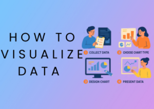
Visual Speak: Telling Stories with Charts and Graphs
Imagine sitting through a presentation or diving into a report filled with endless numbers, percentages, and datasets. *Yawn*, right? Now imagine that same information brought to life with colorful charts, engaging graphs, or interactive visuals. Suddenly, those boring numbers have personality and purpose. That’s the magic of visual storytelling!
The Power of Visuals in Data Communication
Our human brains are hardwired to process visual information faster than text. In fact, research shows that we process images 60,000 times faster than written words! When you pair this with complex data, visuals become a powerful tool to distill intricate ideas into digestible bites. Why tell when you can show? A simple pie chart, bar graph, or heatmap can communicate patterns, trends, or anomalies at a single glance.
Why Charts Always Steal the Show
Charts and graphs don’t just make data look prettier—they help tell compelling, evidence-based stories. Want to highlight a shift in consumer trends over time? A line graph will show you. Need to compare results across categories? A well-designed bar chart delivers clarity. Looking to showcase proportions or relationships? Pie charts, histograms, and scatter plots are your best friends. Each type of chart gives your audience a deeper connection to the data, turning abstract numbers into relatable insights.
Tips to Create Visuals That WOW
- Choose the Right Chart: Different datasets call for different chart types. It’s tempting to stick with old favorites like bar graphs, but sometimes a scatter plot or heatmap might tell the story better.
- Keep it Simple: Overcomplicating your visuals with too many elements or colors can lead to confusion. Stick to minimalism and make sure your key message shines through.
- Color with Purpose: Use color to guide the viewer’s focus. Contrasting colors can help emphasize points, while muted palettes ensure readability for charts with large datasets.
- Make It Interactive: If your project allows, explore tools that let viewers interact with the data, such as zooming on time-based charts or clicking to explore deeper layers of data. Platforms like Tableau or Power BI can be game-changers.
- Add Context: Always add legends, captions, or annotations to explain your visualizations. If someone doesn’t understand what they’re looking at, you’ve already lost their attention.
The Emotional Side of Data Visualizations
Think data can’t strike an emotional chord? Think again! A well-crafted visual can inspire action, drive decisions, or even provoke change. Take, for example, the iconic world population graphs or climate change data visualizations. These often stir deep emotional responses because they make abstract challenges more real. Next time you’re designing a chart, ask yourself—what feelings should this visual evoke? Excitement, concern, hope?
Avoiding Common Visual Pitfalls
- Overloading It: Too much data in one graph can overwhelm your audience. If you have multiple points to tell, consider breaking them into a series of visuals.
- Misleading Visuals: Avoid skewing axes, distorting proportions, or omitting crucial data points. Visual integrity matters as much as visual appeal.
- Ignoring Accessibility: Consider individuals with color blindness by ensuring sufficient contrast and use patterns or labels in addition to colors.

