So, you’ve got data—numbers, percentages, trends—but now you’re wondering, “What’s the best way to show this information?” Well, great question! Choosing the right graph isn’t just important; it’s the key to effective communication. To make data shine (and not confuse your audience), you first need to ask: what kind of data are you working with?
Numerical vs. Categorical Data: Wait, What?
Numerical data is all about numbers that have measurable meaning—population growth, revenue figures, or temperature changes over time. Categorical data, on the other hand, deals with groups or “categories,” such as types of fruit sold in a market or votes by different age groups. Mixing these up could lead to some major confusion with your graph!
For example:
- Numerical data often fits well with line charts if you’re tracking trends over time, such as monthly website traffic.
- Categorical data is usually best visualized using bar graphs or pie charts, especially if you want to compare categories like sales by product type or the market share of competing brands.
Ask Yourself: What’s the Goal of Your Graph?
A quick tip: before you dive into graph-making, think about what you’re trying to achieve.
- Do you want to show change? If your data spans time or shows how something has evolved, a line graph might tell that story best.
- Comparing categories? Bar graphs are often the simpler, cleaner choice for showing side-by-side comparisons.
- Highlighting proportions? Pie charts excel here, especially if you want to say, “Hey, look at how big this slice is compared to the rest!”
Remember, your chosen graph should simplify complex information, not make it harder for your audience to understand. An overloaded or mismatched graph can confuse readers and bury your key insights.
Bar Graphs: Visualizing Change and Comparison with Greater Clarity
When it comes to telling a story with numbers, bar graphs often steal the spotlight for their simplicity and effectiveness. Whether you’re trying to compare sales figures across multiple products, track changes over time, or highlight disparities among categories, bar graphs can help you communicate your data with clarity. Let’s dive into why bar graphs are such a staple in data visualization and how you can use them to pack the most punch.
Qualitative vs Quantitative research: Read More.
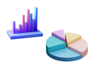
Why Choose Bar Graphs?
Bar graphs are incredibly versatile tools. The magic lies in their ability to make comparisons straightforward for your audience. They work particularly well in these scenarios:
- Displaying comparisons: Imagine you’re comparing monthly expenses. A bar graph can visually show that June’s electricity bill was much higher than July’s, helping viewers grasp the message at a quick glance.
- Highlighting change: Wondering how your budget evolved from last year? A grouped bar graph showcasing year-on-year figures for each expense category can make trends easier to spot.
- Breaking down categories: Visualizing details, like revenue sources for a company or the number of students in various majors, becomes intuitive with bar graphs.
The bars make it easy for the audience to process the data. Longer bars often instinctively imply “more,” so there’s minimal mental effort required to interpret them. That’s why they’re a go-to for effective storytelling in presentations, reports, and infographics!
When Bar Graphs Shine Brighter
While bar graphs aren’t always the right choice, they excel when you’re dealing with specific types of data:
- Comparing numeric values across categories: If you’re comparing the number of votes each candidate received in an election, bar graphs are perfect. Each bar’s length immediately communicates a candidate’s performance.
- Showing relative differences: Say you want to illustrate the difference in customer satisfaction scores between two competing brands. A bar graph captures that disparity effectively, even if one brand is slightly better than the other.
- Visualizing large datasets: When you’re working with categories that might otherwise turn into a cluttered table, stacked or grouped bar graphs shine by packing information without overwhelming viewers.
Horizontal or Vertical Bars? Choose Wisely!
Believe it or not, whether your bars go up and down (vertical) or side to side (horizontal) can make a difference. Vertical bars are the classic choice, but horizontal bars can be just as helpful, especially when you’re working with long category names or ranking items—the horizontal space allows for better label visibility. Simple tip: match the orientation to how the data feels more natural to read.
Line Charts: Connecting the Dots in Trends and Data Over Time
When it comes to storytelling with data, line charts are like the steadfast, reliable friend who always puts things in perspective. They help you see how numbers change over time, connecting data points with a continuous line that guides you through trends, patterns, and fluctuations. But when exactly should you use a line chart, and how can you make the most of it? Buckle up—let’s dive into the world of dynamic data visualization!
When to Use a Line Chart
Line charts are heroes for data that unfolds across time or sequences. Whether you’re tracking daily temperatures, monthly sales figures, or annual website traffic, line charts shine because they reveal trends in a clear, connected manner. Here are a few scenarios where a line chart steals the show:
- Tracking Growth Over Time: Got data that spans a timeline? Line charts are ideal for showing upward or downward trajectories, like how a company’s profits evolved over quarters.
- Spotting Seasonality: Think about retail sales peaking around holidays or temperature rising in the summer. A line chart quickly highlights repeating patterns.
- Comparing Trends: Add multiple lines to the same graph, and you can instantly compare trends side-by-side. For example, how two competitors’ revenues stack up over the years.
Line Chart Superpowers: Why They Work
The magic of line charts lies in how they simplify complex datasets into something intuitive and digestible. Seeing a smooth—or jagged—line makes fluctuations and consistencies easy to interpret. Here’s why they’re so effective:
- They Create a Narrative: A line chart walks us through the story of the data. For instance, the slow climb on a startup’s revenue graph tells the tale of hard work paying off.
- Focus on Transitions: The slope of a line communicates a lot—an upward surge means rapid growth, while a flat plateau is like the calm before the storm. Line charts let these transitions speak volumes.
- Time and Continuity: Data points along a line naturally reflect time passing. This continuity makes it easier for viewers to connect the dots—literally!
Tips for Making Your Line Chart Stand Out
Now that we know how awesome line charts are, it’s crucial to design them effectively. The beauty of a line chart can fade if it’s overcrowded or unclear. Let’s keep it sharp with these pointers:
- Limit the Number of Lines: A few lines are fine, but twenty of them? That’s overwhelming. Stick to four or fewer if you can.
- Choose Contrasting Colors: Different lines should stand out with distinct hues. Avoid colors that are too similar—they’re tough to differentiate at a glance.
- Label Clearly: Include clear axis labels and data markers when needed. Your audience shouldn’t have to guess what’s being plotted!
- Keep Scales Consistent: A badly chosen axis can distort your message. Always make sure your scales are accurate and fair.
- Show Major Milestones: If there are standout data points (a sudden dip, a peak), call them out! Add annotations to guide viewers to key moments.
Common Missteps to Watch Out For
Even with the best intent, it’s easy to trip up when creating line charts. Avoid these common mistakes to keep your visuals professional:
- Ignoring Data Points: A smooth line is lovely, but if the actual data points aren’t shown, your audience might wonder if you’re hiding something.
- Overly-Small Time Increments: Showing too much granularity (like hourly data on a year-long chart) can lead to busy visuals that feel impossible to read.
- Forcing Data That Isn’t Sequential: A line chart isn’t the best tool for unrelated data. Use it only when continuity makes sense.
Pie Charts: Seeing Proportions Where Parts Create a Whole
Ah, the pie chart. Few visual tools are as instantly recognizable — or as polarizing. Love them or hate them, pie charts are here to stay, and for good reason. When designed correctly, they offer a fantastic way to represent parts of a whole in a way that’s both simple and visually compelling. Let’s dive into when and why you should turn to a pie chart, as well as what makes them uniquely effective.
When to Use a Pie Chart
At its heart, the pie chart is all about proportions. Think of it as the perfect way to visually answer one major question: how does each piece contribute to the whole? If your data has discrete categories that make up 100% of a dataset, then a pie chart might be the perfect fit. Here are a few example scenarios where they shine:
- Market Share Data: If you’re illustrating how different companies stack up in a total industry, a pie chart can make each company’s contribution crystal clear at a glance.
- Budget Breakdown: Want to visually display how your budget is divided among categories like rent, groceries, and savings? A pie chart makes it easy to compare slices.
- Survey Results: For questions that let people choose one option (e.g., “What’s your favorite fruit?”), pie charts can show proportions beautifully.
In any of these cases, your audience gets an immediate sense of “who has the biggest slice of the pie” or how evenly the parts are distributed.
When NOT to Use a Pie Chart
While pie charts can work wonders with the right kind of data, they’re certainly not a one-size-fits-all solution. Here are some common situations where they fall flat:
- Too Many Categories: A pie chart with 20 slices is not only confusing but also impossible to read. If your data has more than 5-7 categories, it’s time to consider an alternative (like a bar graph).
- Data Not Summing to 100%: This one’s a little obvious, but worth reiterating: pie charts are meant to show how a whole is divided. If the total doesn’t equal 100%, your audience might wonder what went wrong.
- Trend Over Time: Want to show changes in market share or budget distribution year-over-year? A line chart is far better suited to this task.
By steering clear of these scenarios, you’ll ensure your pie chart doesn’t deliver a muddled or misleading message.
Dos and Don’ts for Effective Pie Charts
Want your pie chart to pack a visual punch? Here are a few expert tips to keep things clean, clear, and engaging:
- Do limit the number of slices: Avoid overloading the chart. If one category is tiny, consider grouping it with others into an “Other” slice.
- Do label directly: Sure, legends are useful, but directly labeling slices makes the data much easier to digest — literally and figuratively.
- Don’t play with 3D effects: As cool as they may look, 3D pie charts can distort proportions and are harder to read. Stick to flat designs for accuracy.
- Don’t compare multiple pies: Comparing data across multiple pie charts can be confusing. If you have lots of datasets, a bar chart or stacked bar chart might be a better choice.
The Psychology Behind Pie Charts
Why do pie charts resonate with audiences so well? It’s all about how humans process visual information. Our brains are wired to quickly understand percentages and proportions in circular form. Seeing how slices fit together like pieces of a puzzle makes the relationships between your data points feel intuitive.
That said, pie charts rely heavily on color and shape for communication, so it’s crucial to use contrasting colors and logical ordering (e.g., smallest to largest) to make them as digestible as possible. Remember, accessibility matters — always opt for colorblind-friendly palettes for inclusivity.
Real-World Applications: Picking Graphs Based on the Problem at Hand
Let’s face it—choosing the right type of graph for your data can feel overwhelming at times. Should you reach for a bar graph, a line chart, or maybe a pie chart? The good news is that the decision doesn’t have to be a guessing game. By thinking about what story you’re trying to tell, you can make a more informed and visually impactful choice. So, let’s dive into how selecting the right graph can make or break your data visualization in the real world.
Ask Yourself: What’s the Message You’re Communicating?
Start by considering the purpose of your data visualization. What insights are you trying to share? For instance:
- Are you showcasing data with a time element, like monthly sales growth? (Hint: That’s a job for a line chart, not a pie chart!)
- Are you comparing multiple categories, like revenue by product type? A bar graph might be your new best friend.
- Do you want to highlight proportions, such as how your budget is allocated? A pie chart works wonders for those situations.
It all starts with understanding the type of story your data wants to tell. Once you’ve got clarity on that, the right graph often leaps out at you.
Different Real-World Scenarios: Choosing the Best Graph
To make things simpler, let’s break down some common situations and the ideal graph choice for each:
- Tracking Patterns Over Time:
When you’re working with historical data—like website traffic over the last 12 months—a line chart wins every time. The continuous nature of the line allows your reader to see trends, spikes, and dips at a glance. - Comparing Specific Metrics Across Categories:
Let’s say you’re a manager comparing team performance by department. A bar graph does this beautifully by placing categories side by side for easy comparison. - Breaking Down Budget Allocation:
If you’re presenting how a business budget is distributed across departments, using a pie chart helps show your audience the bigger picture. Just make sure the proportions don’t go overboard—pie charts are most effective when limited to around 4–6 categories.
Adapt to Your Audience, Too
Remember, your audience plays a huge role in determining what graph works best. A technical audience might appreciate complex data trends (hello, line charts and stacked bar graphs!). But if you’re visualizing simpler results for non-experts, such as a CEO or a general audience, they might prefer straightforward, clean visuals like a bar or pie chart. Always consider who’s consuming the information and tailor accordingly.
Common Pitfalls: Missteps to Avoid in Visual Data Representation
So, you’ve decided to present your data visually—good call! Graphs and charts are fantastic tools for making numbers easier to digest, but let’s pause for a moment. Have you ever tried to decode a chart only to leave more confused than when you started? It happens to the best of us. When it comes to visual data representation, some missteps can distort messages or leave readers scratching their heads. But don’t worry! In this section, we’re diving into the common pitfalls so you can steer clear of them and create charts that truly resonate with your audience.
1. Overloading the Chart with Too Much Information
Imagine you’re staring at a bar graph with 50 categories, each represented by a tiny sliver of information. Overwhelming, right? One of the most common mistakes is cramming too much data into a single chart. While it might feel efficient to include everything, it often does more harm than good. Instead:
- Simplify: Focus on the most important insights you want to convey.
- Group similar data: If categories are too granular, consider bundling them into logical groups.
- Use multiple graphs: Sometimes, splitting data across different visualizations is more effective.
2. Choosing the Wrong Graph
Not all graphs are created equal, and it’s critical to select the one that best fits your data. A pie chart, for instance, might look fun to use, but if you’re comparing change over time, a line chart or bar graph would be more appropriate. Here’s a quick cheat sheet to help you match your data to the right graph:
- Bar Graphs: Use these for comparisons or showing discrete values side-by-side.
- Line Charts: Perfect for trends or continuous data over time.
- Pie Charts: Best when you want to show proportions—but stick to a small number of segments.
Choosing wisely ensures your audience gets the right message, fast.
3. Ignoring Accessibility
Your chart might look amazing, but is it accessible to everyone? Think about people with color vision deficiencies or those who rely on screen readers. To keep your visualizations inclusive:
- Use contrast-friendly colors: Avoid palettes that are hard to distinguish (e.g., red and green together).
- Label everything: Don’t rely solely on color to explain your data—add text labels where needed.
- Provide descriptive captions: This helps people who cannot view the chart still grasp its message.
4. Forgetting Context
Have you ever seen a chart with numbers but no explanation? It’s like walking into the middle of a play and trying to make sense of the plot. Always provide enough context for your audience to understand your visualization. Include:
- A descriptive title: It should make the purpose of the chart crystal clear.
- Axis labels: Don’t leave your audience guessing about what’s being measured.
- Keys or legends: Explain colors or symbols if you’re using them.
5. Misleading Visuals
Finally, one of the most damaging missteps is unintentionally creating a misleading chart. This usually happens when scales are manipulated or comparisons are made between incompatible data sets. Here are a few things to watch out for:
- Keep scales consistent: Starting a Y-axis at a number other than zero can exaggerate trends.
- Avoid cherry-picking: Show the full data set instead of conveniently omitting pieces that don’t fit your narrative.
- Be honest: Data visualization is about clarity, not manipulation.
Decoding Audience Expectations: Matching Graphs with Reader Needs
Visualizing data is as much about the audience as it is about the numbers. Think of it as telling a story – you wouldn’t tell the same tale to a group of children as you would to a room full of scientists. The key to making your bar graph, line chart, or pie chart impactful lies in understanding your audience’s needs and their expectations. So, let’s break this down into something both approachable and practical.
Understand Who You’re Talking To
Before you pick the perfect chart, ask yourself, “Who am I presenting this to?” Is it a team of data analysts, a board of directors, or a group of high school students during a classroom presentation? Each of these audiences has different levels of comfort with data, and they’ll be looking for different things.
- Technical audiences: These are folks who likely have a high tolerance (or even love) for numbers! Here, you can prioritize precision, and they’re more likely to appreciate a line graph to display trends over time or a bar graph to show nuanced comparisons.
- Non-technical audiences: These people might want simpler stories. Pie charts can shine here, breaking gaps or proportions into easy-to-understand pieces, while bar graphs with fewer variables can keep things clear.
- Decision-makers: Decision-heavy scenarios often call for visuals with immediate clarity. These stakeholders are often pressed for time, so concise bar graphs or summarizing pie charts are your friends.
What Are They Looking For?
People don’t look at data in a vacuum – they have questions they’re trying to answer. It’s your role to anticipate those questions and match your graph to give them the clearest answer. Let’s consider a few key scenarios:
- Is their focus on large-scale trends? If so, aim for a line chart. It elegantly shows movement over time, satisfying those looking for patterns or anomalies.
- Do they care about comparisons? A bar graph becomes queen. Seeing stacked or side-by-side bars makes simple work of judging categories against each other.
- Are they chasing proportions? Pie charts make proportions pop. If breaking the whole into parts is your audience’s sweet spot, this tool delivers relevance quickly.
Consider Their Time
Let’s be real—your audience likely has limited time to decode your data. This is where simplicity becomes key. A crowded visual will only frustrate or confuse your readers. When in doubt:
- Use fewer categories on a pie chart (no one likes 20 tiny slices).
- Limit the number of bars or data points for clarity.
- Keep line charts clean with minimal clutter, focusing on standout trends.
Accessibility Matters Too!
Finally, remember accessibility. If your communication welcomes everyone, it becomes far more effective! For instance:
- Use high-contrast colors to ensure readability.
- Label your axes and data points clearly for context.
- Provide a concise description or caption that summarizes the graph’s takeaway at a glance.

