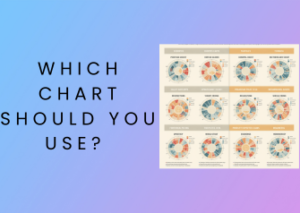
Hello there! Let’s dive into one of the most crucial steps in data analysis: picking the right graph for your data. Think of graphs as the storytellers of the data world. A well-chosen graph can vividly bring your data to life, showcase patterns, and make your findings crystal clear. But where do you start, and how do you choose the perfect graph? Let’s talk about it, friend!
Match Your Graph to Your Goal
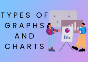
First and foremost, ask yourself: What story do I want my data to tell? Every type of graph serves a specific purpose, so understanding your goal is critical. Are you comparing categories, showing changes over time, or visualizing proportions? Here’s a cheat sheet to help:
- Bar Graphs: Great for comparing categories or groups. For example, want to show the sales of different product types? A bar graph is your hero.
- Line Graphs: Perfect for showing trends over time, like the rise and fall of website traffic weekly.
- Pie Charts: Looking to highlight proportions of a whole? A pie chart works well for visualizing percentages, like how a budget is distributed.
- Scatter Plots: Excellent for spotting relationships or correlations between two data variables, such as study hours and test scores.
- Histograms: Ideal for showing the distribution of data, like the frequency of test scores in a class.
Choosing the right graph isn’t just about aesthetics — it’s about enhancing understanding and making your data accessible to everyone.
Keep It Simple and Intuitive
While you may be tempted to add all the bells and whistles to your graph, here’s a golden rule: simplicity wins. A cluttered graph can confuse your audience and obscure your message. Stick with clear labels, straightforward formatting, and a logical layout. Remember, the goal is clarity, and a clean, minimalist graph delivers that every time.

Consider Your Audience
Another pro tip: always keep your audience in mind. Are you presenting data to a scientific community, a classroom, or a marketing team? The same dataset might need to be visualized differently depending on who’s viewing it. Pie charts might work for executives who want an overview, while a deeper statistical audience might prefer scatter plots with trend lines. Tailor your graph to your audience’s level of expertise!
Test Your Graph’s Message
Before finalizing your graph, put it through a quick sanity check. Ask someone unfamiliar with your dataset to take a look. If they grasp the key takeaway without needing an explanation, congratulations — your graph is doing its job. If they look confused or have a lot of questions, it might be time to revisit your design.
Key Elements Every Data Analysis Worksheet Should Include
If you’ve ever found yourself staring at a graph, wondering how to even begin interpreting it, you’re not alone! A solid data analysis worksheet can be a lifesaver. But what separates a mediocre worksheet from one that really helps you unravel your data? Let’s dive into the key elements every great data analysis worksheet must have to help you approach data with confidence, clarity, and purpose!
1. Clear Objective or Purpose
First things first: your data analysis worksheet absolutely must have a clear objective. Without knowing why you’re analyzing the data, it’s easy to get lost in the numbers. A strong worksheet starts with a concise introduction, explaining the goal of the analysis. Are you trying to compare trends over time? Identify relationships between variables? Explore patterns in a dataset? A clear purpose gives everything else on your worksheet direction.
2. Structured Data Overview
A good data overview sets the stage for analysis. This section should summarize the dataset you’re working with. For example:
- What type of data are you analyzing? Is it numerical, categorical, or both?
- What variables or columns exist? Provide a brief list of key variables and their definitions.
- Any data limitations or context. Are there missing entries? Any known biases? Understanding the constraints of your data is just as important as analyzing it!
Think of this section as the “map” for your analysis journey—it provides context and helps everyone involved stay oriented.
3. Sections for Observations and Inferences
Analysis is about more than plugging numbers into formulas—it’s about finding meaning. Make sure your worksheet dedicates space specifically for writing down observations and inferences. Use a format that’s easy to follow, like splitting the sheet into two columns: one labeled “What I See” (for your initial observations), and the other labeled “What It Means” (for interpretations or inferences).
This structure is a game-changer because it encourages you to document not just facts, but also what those facts signify.
4. Area for Graph Annotations
Your worksheet should also have space to sketch or insert graphs alongside your analysis. Even better? Include some room nearby for annotations. Point out unusual trends, identify peaks and valleys, or circle moments that stand out. Visuals are immensely powerful for conveying data relationships—don’t overlook this aspect!
5. A “Next Steps” Section
What comes after analyzing your data? That answer should be baked into your worksheet! Whether it’s recommending actions based on insights or setting up further study areas, a wrap-up section that outlines next steps turns raw analysis into actionable intelligence. A simple prompt like “Based on this data, what should happen next?” can lead to some surprisingly robust action plans.
6. Space for Questions and Reflections
Finally, don’t forget to leave a section for questions or reflections. Data analysis often raises as many questions as it answers. What didn’t the data reveal? Are there potential biases in the analysis? Asking these questions ensures that your worksheet remains dynamic, fostering curiosity and inviting deeper exploration.
Common Mistakes to Avoid When Analyzing Graphs
Analyzing graphs can be incredibly rewarding, but let’s face it: even the most seasoned data pros can stumble over a few pitfalls. Whether you’re plotting a simple bar graph or diving deep into scatter plots, avoiding these common mistakes can save you time, effort, and even some confusing or inaccurate conclusions. Let’s go over a few of these missteps so you can approach your graphing and data analysis with more confidence!
1. Ignoring Your Audience
Who’s viewing your graph? This question might seem obvious, but it’s often overlooked. Graphs are powerful tools for communication, and the way you present your data should align with the background knowledge of your audience. For example, are you creating a report for technical team members, or is your audience non-technical? Using complex visuals like histograms for non-technical audiences could leave them scratching their heads. Stick to simplicity and clarity for a broader audience.
2. Choosing the Wrong Graph Type
One of the most frequent mistakes is selecting a graph that doesn’t match the data. For instance:
- Pie Charts: Great for showing proportions but disastrous when dealing with too many categories or close values.
- Bar Graphs: Fantastic for comparing distinct groups, but not ideal for showing trends over time.
- Line Graphs: Excellent for showing trends over time, but confusing for categorical comparisons.
The key is thinking through what kind of story your data is trying to tell before you start plotting!
3. Forgetting to Label Axes and Units
We’ve all seen a graph that looks visually appealing but leaves us scratching our heads thinking, “What am I looking at?” Failing to label the axes—or worse, omitting the units—can make even the most beautiful graph utterly useless. Always take the time to clearly label each axis and include units of measurement where applicable. This small step adds credibility to your work and makes your data easier to understand.
4. Using Misleading Scales
Nobody likes deception—especially when it comes to graphs. Manipulating a graph’s scale to “enhance” your data’s importance is a classic blunder. Does your Y-axis start at 50 instead of 0? This can make small differences look gigantic and lead viewers to incorrect conclusions. Always ensure that your scales are consistent and logical. If you need to focus on a specific range, be sure to call it out explicitly so your readers understand.
5. Overloading with Data
Sometimes less is more! While it might be tempting to cram every single data point, detail, or metric into your graph, doing so risks overwhelming your audience. Too much clutter obscures the key message. Stick to the most relevant data points for your objective. If necessary, consider creating multiple graphs to showcase multiple aspects of your analysis rather than mixing them all into one confusing visual.
6. Misinterpreting Correlation as Causation
One of the cardinal sins in data analysis is looking at a graph and jumping to conclusions. Just because two trends seem related doesn’t mean one causes the other! Correlation does not equal causation. Always consider context and avoid drawing conclusions solely based on how two datasets appear to align.
7. Forgetting to Test Your Graphs
This one’s easy to overlook but makes a huge difference: before you present your graph, test it! Show it to a colleague, friend, or classmate and ask them what they interpret. It’s a great way to catch any confusing labels, misleading visuals, or missing elements that may have slipped your notice.
Real-Life Scenarios Where a Graphing Worksheet Can Help
Let’s face it: data can sometimes feel overwhelming, especially when you’re faced with a mountain of numbers and no clear way to interpret them. That’s where graphing worksheets come in! A graphing and data analysis worksheet can be a powerful tool in unraveling complex information, making trends and patterns easier to spot, and helping you make evidence-based decisions. Below, we’ll unpack some real-life scenarios where a graphing worksheet can be incredibly useful.
1. Budgeting and Personal Finances
Think of how many times you’ve asked yourself, “Where is all my money going?” Whether you’re managing household expenses or tracking savings goals, a graphing worksheet is your best friend. Creating a pie chart that breaks down monthly spending by categories like groceries, rent, and entertainment can give you a visual overview of your financial behavior. This makes it easier to identify areas to cut back or adjust for better financial health.
2. Academic Projects and Science Experiments
If you’re a student (or helping one), graphing worksheets are indispensable in the realm of experiments and research. Imagine conducting a plant growth study where you track height over time under different conditions. Using a line graph worksheet, you can visually compare each group’s performance and draw clear conclusions.
Teachers, this one’s for you too! By incorporating graphing into lesson plans, you offer students a hands-on experience that not only strengthens their understanding of the subject but also improves their data literacy—an essential skill for careers in STEM and beyond.
Time-Saving Tip: Use pre-designed templates for graphing worksheets so students can focus more on interpreting data rather than worrying about formatting their graphs.
3. Business Decision-Making
In the business world, decisions often hinge on being able to analyze data quickly and effectively. For example, if you’re a shop owner evaluating sales trends, a monthly bar graph showing product performance can highlight what’s working and what’s not. Similarly, marketing teams can use graphing worksheets to analyze metrics like website traffic, conversion rates, or customer demographics. These insights empower you to make strategic adjustments based on clear evidence.
Actionable Insight: Always pair your graphs with a short summary of key takeaways. This helps team members understand the data’s implications without needing to dig into the numbers themselves.
4. Fitness and Health Goals
Ever set a fitness goal but struggled to track your progress? Whether your aim is to lose weight, increase your running distance, or simply build healthier habits, a graphing worksheet is a great motivator! Plot metrics like weight loss, step count, or gym attendance on a line graph to visualize progress and stay accountable.
5. Climate and Environmental Studies
For environmental enthusiasts, visualizing data is key to understanding complex topics like carbon emissions, rainfall patterns, or temperature fluctuations. A graphing worksheet is invaluable when presenting this information, whether it’s for academic purposes, policy discussions, or even just sharing knowledge within a community group. For example, creating a temperature trend graph over a decade can highlight concerning shifts in climate and encourage action.
Pro Insight: Use annotations on graphs to call attention to key points, like notable spikes or drops. These tools become more effective advocacy instruments when paired with data that tells a story.
The Bottom Line
No matter the scenario—be it personal, professional, or academic—graphing worksheets are practical tools for making sense of data. They simplify the chaos, help you spot trends, and, most importantly, guide you toward informed decisions. So, next time you feel like data is an unsolvable puzzle, remember that a graphing worksheet can be your roadmap to clarity!
- Need help getting started? Explore free graphing worksheet templates or software tools that include pre-made layouts.
- Remember: It’s not just about creating a graph—it’s about telling a story with your data. Make it clear, concise, and visually appealing!
Best Practices for Labeling and Organizing Your Data
Hello there! Let’s dive into something super important when it comes to graphing and data analysis: labeling and organizing your data. Trust me, putting thought into how you structure your information can make a world of difference. Whether you’re assembling a pie chart for a school project or crafting a line graph for a business report, proper organization brings clarity and impact to your work. So, here’s how to do it the right way.
Why Is Labeling So Important?
Imagine staring at a beautifully designed graph with no labels. Confusing, right? Labels are the bridge between raw data and understanding. They help your audience grasp exactly what you’re presenting. Plus, organized labeling can save you from follow-up questions like “Wait, what does this axis capture?” or “What are these percentages about?”
Best Practices for Labeling Your Data
Proper labeling is both an art and a science. Here’s a breakdown of practical tips:
- Use clear, concise titles: The title should tell your audience exactly what the graph represents. Think of it as a mini summary in one line.
- Label your axes: For graphs with axes (like bar charts or scatter plots), include both labels and units of measurement. For example, instead of just writing “Time,” label it “Time (Hours)” to eliminate confusion.
- Legend is your best friend: If your graph includes multiple data sets, a neatly organized legend is a must. Assign colors, patterns, or markers to make the legend easily understandable.
- Be mindful of font sizes: Ensure your labels and titles are visible. Tiny text can leave your audience squinting—or worse, ignoring your work.
- Keep terminology consistent: If you use “Revenue” on one part of your worksheet, don’t call it “Earnings” elsewhere. Consistency makes your data easier to follow.
Tips for Organizing Your Data
Once your data is labeled correctly, the next step is to keep it neat and organized. A cluttered graph or worksheet can confuse your audience and dilute your message. Here’s how to organize like a pro:
- Start with clean data: Before you get into graphing, ensure your data is free of errors, duplicates, or inconsistencies. A clean spreadsheet is half the battle won.
- Group related data logically: Arrange your data in a way that highlights patterns or comparisons. For instance, in bar charts, sort categories from smallest to largest or vice versa for a quick visual impact.
- Use spacing wisely: Don’t overcrowd your graph with information. Leave enough white space to make your visual look polished and readable.
- Stick to a hierarchy: Organize your worksheet by importance or process. For example, lead with high-level data summaries and then dive into details as you move forward.
- Color-code strategically: If you’re using multiple colors, stick to a limited palette and assign colors that make sense (e.g., green for growth, red for decline).
Tools and Templates to Simplify Graph Creation
Creating graphs doesn’t have to be a daunting, hours-long process. Thanks to the right tools and templates, turning your data into clear, appealing visuals is easier than ever. Let’s dive into some of the best and most user-friendly options available, along with a few expert tips on how to make the most of them. Whether you’re new to graphing or a seasoned pro, these suggestions will save you time and effort!
Why You Need the Right Tools
First things first—why bother with specific tools? When it comes to graph creation, the right tools can make all the difference in ensuring your data is accurate, well-organized, and visually appealing. They eliminate room for errors, speed up your workflow, and allow your graphs to shine, even if design isn’t your strong suit.
Plus, with pre-built templates, you no longer have to start from scratch. They give you a head start with layouts and designs tailored for almost every kind of dataset imaginable. The results? Professional-looking graphs that deliver information quickly and clearly to your audience.
Top Tools for Graph Creation
Here are some standout tools that simplify graph creation, no matter the scale of your project:
- Excel: A tried-and-true classic. Excel remains one of the most popular graphing tools due to its versatility. You can create bar charts, scatter plots, pie charts, and much more—all with just a few clicks. It’s a great option for people who are already working with spreadsheets.
- Google Sheets: Google Sheets combines the functionality of Excel with the convenience of cloud access. Its built-in charting features are easy to use, and it’s perfect for people collaborating on data from multiple locations.
- Canva: If aesthetics are your priority, Canva is a fantastic option. While it’s a graphic design platform at heart, Canva has pre-made templates for graphs and charts that you can personalize to match your branding or presentation style.
- Tableau: For more advanced data visualization, Tableau is hard to beat. It’s an excellent tool for handling large datasets or creating highly interactive graphics that allow others to engage with your data dynamically.
- Flourish: Want animations or interactive graphs? Flourish makes it easy for beginners to create stunning, shareable visuals. Think maps, timelines, or multi-dimensional charts.
Free Templates to Jumpstart Your Project
Templates are a lifesaver. They provide clear frameworks for your graphs and save you from agonizing over fonts, colors, and layouts. Here are some of the best places to find templates:
- Microsoft Office: If you’re using Excel, PowerPoint, or Word, take advantage of Microsoft’s library of templates for charts and graphs. Easy to customize and highly versatile, they work for most common data sets.
- Google Workspace: Google’s free templates are great for quick projects and are especially helpful for educators, team collaborations, or small business needs.
- Canva Templates: Canva offers a robust library of free and premium templates designed for everything from science fair posters to professional reports.
Insider Tips to Maximize These Tools
Here are a few expert tips to help you get the most out of these tools and templates:
- Keep it simple: Avoid overly-complicated graphs. Stick to visuals that are easy to interpret at a glance.
- Use consistent colors: Choose a color palette that aligns with the message of your data—soft pastels for trends, bold hues for contrast, etc.
- Preview before sharing: Always double-check how your graph looks on different devices and resolutions if it will be shared digitally.
- Customize templates as needed: Templates are a starting point; adjust fonts and spacing to make sure your graph is tailored to your data’s specific needs.
Investigating Trends: Turning Data into Actionable Insights
Hello there, data enthusiast! Let’s dive into what might be the most exciting part of the graphing and data analysis journey: investigating trends and transforming your data into actionable insights. Sure, graphs and charts look great, but the magic happens when we figure out what the data is telling us and use it to make smarter decisions. Ready? Let’s go!

Spotting Trends: What Are We Looking For?
First off, when we talk about trends, we’re looking at patterns or movements in the data over a period of time or within a given dataset. These trends can reveal critical insights, from growth and decline to consistency and anomalies.
- Growth Patterns: Is your sales data climbing year over year? Great! That’s a growth trend.
- Anomalies: Did something unusual pop out of nowhere? Hello, investigation time!
- Seasonal Patterns: Are there peaks at specific times (e.g., higher energy usage in summer)? These cyclical trends are key in planning ahead.
Your job is to identify these patterns and assess their significance. Sounds simple enough, right? But there’s an art to it. Let’s make sure you’re doing it properly.
Ask the Right Questions
To truly turn trends into insights, start by asking questions like:
- What story is the data telling me? For example, if you see a steady increase in website traffic, dig into the why. Did your marketing campaign perform better? Is something seasonal driving it?
- Are there unexpected dips or spikes? Strange movements in your data are worth investigating. Was the data incorrectly recorded? Did something external cause a change?
- How does this trend impact my goals? If you’re a business owner and diners have stopped coming on Tuesdays, what can you do to turn that around?
These questions will guide you toward understanding what’s happening so you can take meaningful action.
Data-Driven Action: How to Move Forward
Now that you’ve identified the trends, it’s time to use them in a way that leads to impactful decisions. Here’s how you can turn those insights into action:
- Communicate Clearly: Once you’ve uncovered a trend, share it! Visualize the trend graphically and explain its implications to your team or stakeholders. A clear story beats a busy spreadsheet every time.
- Set Goals Based on Insights: If a trend shows you’re underperforming in an area, create measurable goals to improve it. On the flip side, if things are going great, find ways to replicate that success elsewhere.
- Experiment and Track Results: Use the trends to justify trial-and-error strategies. For instance, try new marketing approaches during low-traffic times and see how they impact the data over time.
Why Trends Are Powerful
Trends allow you to shift from being reactive to proactive. Instead of waiting for a problem to become glaring, you can anticipate challenges, opportunities, and needs. Whether it’s identifying cost savings, launching an innovative product, or finding underperforming areas to improve, trends make you the captain of your data ship!