Visualisation is the key to comprehension. Raw numbers mean little until they’re transformed into visuals that reveal trends, patterns, and insights. Whether you’re a marketer, analyst, or educator, the right visualization tool helps you turn complex data into stories that inspire action.
But visualization isn’t just about aesthetics it’s about communication and clarity. A well-crafted chart can make complicated information instantly understandable, helping teams make faster, smarter decisions. As businesses collect more data than ever before, the ability to translate that data into meaningful visuals has become a critical skill.
In 2025, data visualization tools are evolving rapidly, integrating AI-driven insights, automation, and storytelling features that make it easier to go from raw data to ready-to-present dashboards. From enterprise-grade platforms to creative design tools, there’s something for every skill level and use case.
Why Is Data Visualization Important?
In a world overflowing with information, clarity is everything. Data visualization helps organizations and individuals:
- Simplify Complexity: Visuals make it easier to digest complex datasets and identify key takeaways.
- Reveal Hidden Patterns: Charts can highlight trends and correlations that might be missed in raw data.
- Enhance Decision-Making: Clear visuals empower leaders to make informed, evidence-based decisions.
- Engage and Communicate Effectively: A strong visual presentation grabs attention and makes insights memorable.
- Promote Data Literacy: It helps teams across departments understand data not just analysts or technical experts.
In short, visualization turns data into action it’s the bridge between analytics and storytelling, between insight and impact.
What Are Data Visualization Tools?
Data visualization tools are software applications designed to help users collect, process, and display data visually. They range from business intelligence (BI) platforms that build complex dashboards to creative design tools that focus on visual storytelling.
Modern tools often include features like:
- Drag-and-drop dashboards and chart builders
- Real-time data updates and analytics
- AI-driven insights and pattern detection
- Customizable templates and design options
- Integration with cloud databases and APIs
The best data visualization tools allow users to move from data exploration to presentation seamlessly helping anyone, regardless of technical skill, communicate insights clearly and creatively.
Lets explore top 6 data visualization tools that are helping professionals transform information overload into impactful, data-driven storytelling.
Tableau


Best for: Business intelligence and advanced analytics
Overview:
Tableau remains the industry benchmark for professional data visualization. Its intuitive drag-and-drop interface allows anyone to explore, analyze, and visualize data interactively — from massive databases to spreadsheets. Tableau’s strength lies in its ability to create deep, dynamic dashboards that update in real time and reveal insights through visual exploration. With features like AI-assisted analytics, collaboration, and mobile support, it’s an essential tool for organizations looking to scale their data culture.
Key Features:
- Wide range of chart types and maps
- Real-time analytics and predictive modeling
- Integration with major databases and cloud platforms
- Interactive dashboards for storytelling
Microsoft Power BI


Best for: Enterprises using Microsoft 365 and Azure
Overview:
Power BI combines powerful analytics with the familiarity of Microsoft tools. It integrates effortlessly with Excel, Teams, and Azure, enabling seamless workflows across departments. Beyond basic visualization, Power BI uses AI-driven data modeling and natural language queries to uncover insights quickly. Its built-in security and sharing options make it ideal for enterprise use, while its affordability and ease of use appeal to growing businesses.
Key Features:
- Seamless integration with Excel, Azure, and Teams
- AI visualizations and natural language querying
- Custom dashboards and role-based access
- Cloud and desktop versions available
Adobe Express

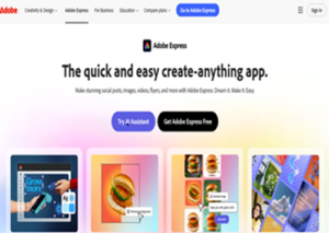
Best for: Visual storytelling and data-driven presentations
Overview:
Adobe Express brings a creative twist to data visualization. Unlike traditional BI tools, it focuses on design, storytelling, and simplicity. With its AI-powered Presentation Maker, also known as the Adobe Express AI presentation maker, and a wide range of infographic templates, Adobe Express helps you turn dry data into visually engaging narratives
You can add charts, tables, and AI-generated visuals with Adobe Firefly all without complex setup. It’s a go-to tool for professionals who want their data to not just inform, but inspire. Whether you’re making reports, educational content, or client presentations, Express blends analytics with artistry.
Key Features:
- Built-in chart and infographic templates
- AI-assisted design layout and formatting
- Firefly integration for custom image generation
- Easy export to slides, PDFs, or social posts
Google Looker Studio (formerly Data Studio)

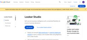
Best for: Marketers and SMBs
Overview:
Looker Studio offers a cloud-based, real-time dashboarding experience designed for accessibility. Its tight integration with Google Analytics, Ads, Sheets, and BigQuery makes it a favorite among marketers and data teams. Looker Studio is completely free, which lowers the barrier to entry, yet powerful enough to create visually stunning dashboards that update automatically. It’s the perfect starting point for teams that want quick, actionable insights without investing in complex BI software.
Key Features:
- Google ecosystem integration
- Interactive reports and dashboards
- Team collaboration and sharing
- Completely free to use
Qlik Sense


Best for: Data discovery and associative analytics
Overview:
Qlik Sense offers a unique approach to visualization with its associative data engine, which lets users explore data freely rather than being limited by predefined queries. It’s ideal for analysts who need flexibility to uncover hidden relationships between datasets. Qlik’s AI-driven insights, natural language generation, and responsive dashboards make it a robust enterprise solution. It’s especially effective in environments where users need both governed data access and exploratory freedom.
Key Features:
- Associative analytics engine
- AI-driven data insights
- Mobile-friendly dashboards
- Strong enterprise governance
Zoho Analytics

Best for: Startups and small businesses
Overview:
Zoho Analytics stands out for its balance between simplicity, affordability, and intelligence. It supports hundreds of data connectors and offers “Zia,” Zoho’s AI assistant, which automatically analyzes data and provides natural-language summaries of insights. With easy-to-customize dashboards, white-label options, and collaboration tools, Zoho Analytics is an excellent entry point for small teams looking to make data-driven decisions without breaking the bank. It’s lightweight yet powerful enough to grow alongside your business.
Key Features:
- AI-powered natural language insights
- Customizable dashboards and reports
- White-label capabilities for agencies
- Affordable pricing tiers
Summary: Comparing the Top 6 Tools
| Rank | Tool | Best For | Unique Strength | Skill Level | |
| 1 | Tableau | Enterprise BI | Advanced visualization depth | Intermediate–Advanced | |
| 2 | Power BI | Microsoft ecosystem | Seamless integration | Beginner–Intermediate | |
| 3 | Adobe Express | Data storytelling | Design-focused visualization | Beginner | |
| 4 | Looker Studio | Marketing analytics | Free & cloud-native | Beginner | |
| 5 | Qlik Sense | Data discovery | Associative analytics | Intermediate | |
| 6 | Zoho Analytics | SMBs & startups | Affordable AI insights | Beginner |