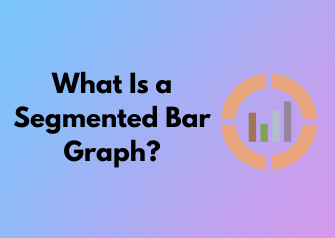
Hello there! Let’s dive into an exciting topic—segmented bar graphs. These handy visual tools are all about representing data in a clear and structured way, and they’ve earned a unique spot in the world of data visualization. But what exactly makes segmented bar graphs different from all those other chart types out there? Don’t worry, you’re about to find out!
First off, think about a regular bar graph—simple, right? Bars of varying lengths represent quantities. But what if you have categories within categories? That’s where a segmented bar graph steps in to save the day. Instead of using multiple separate bars to show subcategories, these graphs stack everything into one neat bar for each main category. Each segment of the bar corresponds to a specific subcategory, making it super easy to compare proportions within a main category while still showing the overall total. Pretty neat, huh?
So, what sets segmented bar graphs apart? Let’s summarize:
- Efficiency: You can avoid overcrowding your graph by stacking related data instead of separating it into multiple graphs or sections.
- Comparability: They make it super simple to compare both totals and parts of the whole without overwhelming viewers.
- Clarity: Because each segment is color-coded (or patterned for accessibility), it’s easy to spot trends and relationships at a glance.
You might also hear them referred to as “stacked bar graphs,” and that’s a fitting name because they quite literally stack the data segments. Whether you’re working with percentages, proportions, or raw values, segmented bar graphs can handle it all.
Visual Simplicity: Why Choose Segmented Over Other Graph Types?
Have you ever been overwhelmed by a wall of numbers or a graph so cluttered with data that it makes you question all your life choices? Trust me, you’re not alone! That’s where segmented bar graphs come to the rescue. It’s like decluttering your data closet, Marie Kondo style. These graphs are easy on the eyes, effective in communication, and downright satisfying to work with.
The Beauty of Simplicity
Segmented bar graphs are all about clarity. They let you compare multiple categories or groups within a dataset while keeping everything in one neat, visual package. Think of it as layering stories within a single illustration—each segment in the bar represents a different category or group, stacked together to show the whole picture. Unlike other graph types, segmented bar graphs strike the perfect balance between showing multiple sets of information at once without overwhelming the viewer.
Why Go Segmented?
Okay, you might be thinking: “Sure, simplicity sounds nice, but why not just stick to regular bar graphs or pie charts?” Great question! Let’s break it down:
- Clear Comparisons: Segmented bar graphs allow you to quickly spot differences or similarities between groups. For instance, imagine comparing age ranges within a population across several cities. Instead of needing several separate graphs, you can visualize all the data in one tidy and intuitive chart.
- Space Efficiency: If you’re trying to cram lots of data into a single graphic (without overwhelming viewers), segmented bars are your secret weapon. They save space while presenting a wealth of information at a glance.
- Shows Relationships, Not Just Numbers: A regular bar graph might show you totals, but segmented bar graphs help you explore proportions and relationships between the parts and the whole. It’s a deeper dive, but in a surprisingly simple format.
- Customizable Storytelling: Need to put emphasis on one category? Want to highlight how a specific segment contributes to the whole? That’s easy with segmented bars because you get to tell a story visually, one segment at a time.
What Makes It Stand Out Among Other Graphs?
You’ve got options when it comes to data visualization: line graphs, scatter plots, pie charts, or those good ol’ standard bar charts. But segmented bars are like the Swiss Army knife of graphs—they combine utility with style.
For instance, pie charts are great for showing proportions, right? But they struggle when you’re comparing data across multiple categories. Nobody wants to be flipping between five pie charts to compare values! Meanwhile, regular bar graphs work for totals, but they won’t show how those totals break down into smaller parts. Segmented bar graphs give you the best of both worlds: total values and a detailed breakdown.
When Should You Choose Segmented Bar Graphs?
So when’s the right time to pull out this nifty visualization tool? Here’s the rule of thumb: use a segmented bar graph when you need to:
- Display proportions within categories (e.g., gender distribution within departments at a company).
- Compare groups across multiple categories (e.g., survey results for several countries).
- Show how individual components contribute to a total (e.g., revenue by product types over time).
Building Blocks: Essential Components of a Segmented Bar Graph
Ever wondered what makes a segmented bar graph stand out? Beyond its vibrant colors and tidy presentation, it’s all about the essential components working seamlessly together. If you’re new to segmented bar graphs, don’t worry! Let’s break down the key elements that make these graphs such a powerhouse for illustrating data.
1. The Bars: Layers of Information
At the heart of every segmented bar graph lies its defining feature: the bars. Each bar represents a central category or group, often something like “age ranges,” “product types,” or “regions.” These bars are further divided into segments, which are color-coded to represent subcategories or parts of the whole. Think of the bar as a stack of smaller building blocks coming together to represent a total value.
The magic lies in these segments because they allow viewers to see proportions at a glance. For example, a bar might be divided into three sections, each showing the percentage of votes cast for three different candidates in an election. It’s clear, concise, and immediately helpful.
2. A Well-Defined Axis
No graph is complete without a clear axis. Segmented bar graphs typically feature two axes:
- The x-axis: This usually displays the categories being compared. For instance, if you’re looking at sales revenue by region, the x-axis would list regions like North America, Europe, and Asia.
- The y-axis: This shows the measurement scale – it could be percentages, amounts, or another type of numerical value. This axis helps readers quickly assess the size of each segment within the bars.
Both axes should be labeled clearly to avoid any confusion. A clean and readable axis ensures your audience knows exactly what they’re looking at without further explanation.
3. Segments with Color-Coding
Color is your best friend when it comes to making segmented bar graphs visually intuitive. Each section or “segment” within a bar is usually represented by a unique color that aligns with a label or legend. For example, a graph illustrating household spending might use blue for rent, green for food, and orange for utilities.
Keep in mind that color choices should promote clarity and accessibility. Avoid colors that are too similar, and consider viewers with color blindness by using patterns or textures in addition to color coding. Simplicity can be surprisingly powerful.
4. A Clear Legend
The legend acts as your graph’s trusty co-pilot, providing context for what each color or pattern represents. A good legend should be positioned where it’s easy to spot but not overshadow the graph itself. Ideally, the labels in your legend are short and self-explanatory so readers don’t have to work too hard to decode them.
5. Labels and Titles
Last but certainly not least, let’s talk about labels and titles. The title of your graph gives readers the big picture – the “what” and “why” of your visualization. Your labels on each axis and within the segments offer the finer details needed to bring the story to life.
Pro tip: Avoid cluttering your graph with too much text. Each label, whether it’s on the axis or the segments themselves, should be concise and intuitive. If you’re presenting percentages or numbers directly within the graph, make sure the font is legible and doesn’t overwhelm the design.
Beyond Numbers: Interpreting Data Insights from Segmented Bars
Segmented bar graphs are more than just colorful charts; they are visual storytellers that bring data to life. While the bars and segments within them represent raw numbers or percentages, the power of a segmented bar graph lies in its ability to unveil patterns and relationships that might otherwise remain hidden in a simple table. Let’s dive into how you can turn those segmented bars into actionable insights!
1. Spotting Proportional Relationships Immediately
One of the biggest advantages of segmented bar graphs is their ability to show proportions at a glance. Each bar is divided into segments that represent parts of a whole, making it easy to see and compare the relative contributions of different categories.
For instance, imagine you’re analyzing product sales by region. A segmented bar graph can show not just total sales for each region (the length of the bar), but also how those sales are distributed across product categories (the segments). This allows you to quickly identify which categories dominate a particular region’s sales or if there’s a balanced mix of products being sold.
2. Uncovering Trends Across Categories
Segmented bar graphs excel at revealing patterns over time or across groups. By lining up multiple bars side by side, you can compare how segment sizes change between groups or over time. Is one category growing while another is shrinking? Are certain combinations consistently outshining others?
For example, if you’re reviewing customer age groups and their preference for a subscription service, a segmented bar graph might show that younger customers tend to choose premium plans, while older customers lean toward basic options. Without the visual organization of segmented bars, spotting trends like this could require sifting through mountains of data.
3. Distinguishing Between Volume and Distribution
One subtle but important insight a segmented bar graph can provide is the distinction between total volume and distribution. Sometimes, a bar might be tall because it represents a high total value, but the segments reveal an uneven distribution, showing that one segment dominates the others.
This dual-layer insight is particularly useful for making balanced decisions. If you’re running a nonprofit and tracking donations by donor type, a tall bar representing corporate donations might look impressive. However, a segmented bar graph might reveal that 90% of corporate donations came from just one donor—a risk factor worth addressing for long-term sustainability.
4. Identifying Gaps and Opportunities
Segmented bar graphs don’t just highlight what’s there—they also make it easy to see what’s missing! Gaps in segments or disproportionate distributions can indicate untapped opportunities or areas of concern.
For example, in a graph comparing customer satisfaction across different service areas, you might notice that one area consistently scores low across all segments. This insight suggests an urgent need for improvements in that area, while high-scoring areas might reveal best practices to replicate.
Common Mistakes to Avoid When Creating Segmented Bar Graphs
Segmented bar graphs are excellent tools for visualizing data in a clear, compact manner, but even the best of us can stumble into a few pitfalls when creating them. By learning what not to do, you’ll be well on your way to crafting graphs that deliver insights effectively and beautifully. Let’s roll up our sleeves and dive into some common mistakes—and how you can easily steer clear of them!
1. Overloading the Graph with Too Many Segments
One of the biggest issues people encounter is trying to cram too much information onto a single bar. While it’s tempting to include every data point for the sake of completeness, it can quickly lead to visual clutter and confusion. Remember, your goal is to tell a story—not overwhelm your audience.
Pro Tip: Aim to limit the number of segments in each bar. If you find yourself exceeding six or seven segments per bar, consider grouping smaller categories into an “Other” category or breaking your data into multiple graphs for clarity.
2. Neglecting Consistent Color Coding
Color is your best friend when creating segmented bar graphs, but it can just as easily become a foe if used improperly. Inconsistent or overly similar color choices can make it hard for your audience to differentiate between segments.
- Do: Use a well-thought-out color palette where each segment is distinct and easy on the eyes.
- Don’t: Use similar shades (e.g., dark blue and navy) that might blur together, or overly bright colors that strain the viewer’s eyes.
If your graph ends up printed in black and white—or accessed by someone with color blindness—consider adding textures or patterns within the segments to increase accessibility!
3. Forgetting to Label Clearly
No matter how stunning your graph looks, its power is meaningless without proper labeling. Labels provide context and help your audience interpret your data with confidence. A common mistake is using too-small font sizes or ambiguous labels that leave people guessing.
- Provide Descriptive Axis Titles: Ensure the axes are labeled with clear, specific names that explain what your data represents.
- Add a Legend: When presenting multiple segments, include a neatly organized legend so viewers know which color corresponds to each category.
Stick to accessible font sizes (14 points or higher for presentations) and avoid abbreviations that may confuse your audience.
4. Misrepresenting Proportions
Accuracy is the hallmark of effective data visualization. A common error in segmented bar graphs is creating bars that don’t accurately reflect the proportions of the underlying data. For instance, if segments don’t align perfectly with the percentage or value they represent, your audience could draw incorrect conclusions.
Solution: Double-check your data, and use tools or software that ensure precise segment alignment. If you’re working manually, validate proportions using a basic percentage calculation before finalizing your graph.
5. Ignoring Audience Familiarity
The most engaging graphs are tailored for their specific audience. A mistake people often make is assuming everyone will immediately understand complex or technical data interpretations. While segmented bar graphs are versatile, they should still be accessible to the people you’re presenting to.
Practical Applications: Where Segmented Bar Graphs Shine
If data visualization were a toolbox, segmented bar graphs would be the multi-tool you turn to for clarity and impact. These versatile graphs aren’t just about stacking colored sections on a bar—they’re designed to break down complex data into digestible, visual bites. But where do they really shine? Buckle up, because we’re about to explore how these graphs can elevate your understanding and presentation of data in real-world contexts.
The Swiss Army Knife of Comparisons
When you need to compare proportions within a category while maintaining the overall relationship between different categories, segmented bar graphs are your go-to solution. For example:
- You’re analyzing customer satisfaction surveys. Each bar in your graph represents a service department (e.g., IT, Sales, Support), but the colors within the bars break down the responses (Satisfied, Neutral, Dissatisfied).
- A segmented bar graph lets you see not only how each department performs overall but also the distribution of responses within each department at a glance.
No other type of graph performs this dual analysis quite as effectively. It’s like having two graphs in one: comparison and composition merged together for maximum clarity.
Spotting Trends in Demographics
Segmented bar graphs are immensely powerful when working with demographic data. Here’s where they shine in this area:
- Population studies: For example, you might visualize the percentage of different age groups in various cities across multiple regions.
- Market segmentation: Want to showcase how different customer personas respond to a specific product? A segmented bar graph reveals nuances that might otherwise go unnoticed.
The ability to dissect the data by subgroups makes it easy to identify patterns and trends, providing insights that fuel smarter decision-making. It’s all about granularity and big-picture thinking—combined seamlessly!
Budget Analysis and Financial Reporting
Need a way to show how budgets or expenses are allocated within a project or organization? Segmented bar graphs make financial data more approachable. Here’s an example:
- Each bar might represent a different department, and the sections within the bars could show how their budgets are divided (staffing, materials, marketing, etc.).
Not only does this make budget breakdowns more transparent, but it also helps stakeholders identify imbalances or areas for optimization. Numbers on a spreadsheet are fine, but a segmented bar graph makes the story jump off the page.
Scientific Research and Beyond
From health sciences to environmental studies, segmented bar graphs are equally at home in academic and scientific settings. They allow researchers to:
- Illustrate the distribution of variables within a study group (e.g., blood types within a regional population).
- Communicate findings to a broader audience in a clean, straightforward way.
Let’s face it—when explaining technical topics, your audience appreciates visuals that don’t require extra ‘decoding.’ Segmented bar graphs are approachable, without sacrificing rigor.

Step-by-Step Guide: How to Create a Segmented Bar Graph with Ease
Feeling a little unsure about creating a segmented bar graph? Don’t worry—you’re in great hands! In this guide, I’m here to walk you through the process step by step. Whether you’re crunching numbers for a school project, presenting data at work, or just exploring new ways to visualize data, crafting a segmented bar graph doesn’t have to be intimidating. By the end of this, you’ll be a segmented bar graph pro!
Step 1: Collect Your Data
Every graph starts with the right data. To create a segmented bar graph, you need to have data broken into categories along with their respective subcategories or proportions. For instance, if you’re analyzing survey results about favorite activities by age groups, your categories might be the age groups, and the subcategories would be the types of activities ranked by popularity.
Step 2: Choose Your Scale
Now that your data is ready, you need to determine an appropriate scale for your graph. The scale is the axis where you’ll measure your values (such as percentages or counts). A segmented bar graph typically uses a linear scale so the proportions of each segment are visually accurate.
- For percentages, your scale usually ranges from 0% to 100%.
- For absolute numbers, pick a range that fits all your data points comfortably.
Remember: A clear and consistent scale makes your graph much easier to understand!
Step 3: Design a Framework for Your Bars
It’s graph-drafting time! Draw your bars either vertically or horizontally—whichever works best for your data. Each bar represents one category, and each segment in the bar corresponds to a subcategory.
The height or length of the bars will be relative to the scale you’ve chosen. Make sure to leave enough space between bars so everything looks neat and professional.
Step 4: Add the Segments
Here’s where the magic begins! Divide each bar into its corresponding segments based on their values. For example:
- Category: Age group 18-25
- Segment 1: 40% hiking, Segment 2: 30% biking, Segment 3: 30% kayaking
Each segment’s size should be proportionate to its value. Color-coding segments can make your graph pop and help the audience quickly distinguish between subcategories.
Step 5: Label Everything Clearly
Never underestimate the power of clear, concise labels. Add titles and labels to your axes, bars, and segments so your audience knows exactly what they’re looking at. For example:
- Axis labels: Percentage of participants
- Bar labels: Age groups
- Legend: Use colors to specify subcategories (e.g., blue = hiking, green = biking).
Step 6: Double-Check for Accuracy
Before wrapping up, take a moment to double-check your work. Are the proportions correct? Do all your segments add up to the total for each category? Accuracy builds credibility!
Helpful Tip: If available, use a software tool like Excel, Google Sheets, or Tableau to automate calculations and avoid any missteps.
Step 7: Polish and Present
Finally, make it visually appealing! Adjust fonts, colors, and formatting to ensure readability. Keep the design simple—your graph should highlight the data, not distract from it. Once polished, it’s presentation time!