
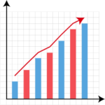
Understanding types of graphs and charts is essential for presenting data clearly and making better decisions. Whether you’re working on a school project, business report, or data analytics dashboard, the right visual can turn complex numbers into easy-to-understand insights.
Different types of graphs and charts are designed for specific purposes. Some help compare values, others show trends over time, and some reveal relationships between variables. In this guide, you’ll learn the most important graph types, when to use them, and real-world examples to help you choose the right one.
What Are Graphs and Charts?
Graphs and charts are visual tools used to represent data in a structured and easy-to-understand way. Instead of reading long tables of numbers, you can quickly identify patterns, trends, and comparisons through visuals.
Featured Snippet Definition:
Graphs and charts are visual representations of data that help simplify complex information, making it easier to understand patterns, trends, and relationships.
Why Choosing the Right Graph Matters
Choosing the wrong chart can confuse your audience or even misrepresent your data. The right graph:
- Improves clarity and understanding
- Highlights key insights instantly
- Helps in better decision-making
- Enhances engagement in reports and presentations
For example, using a pie chart for too many categories makes it hard to read, while a bar chart would be more effective.
Types of Graphs and Charts (With Examples)
Let’s explore the most important types of graphs and charts with practical explanations.
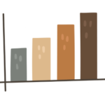
Bar Chart

A bar chart uses rectangular bars to compare different categories.
Best for: Comparing values across categories
Example: Sales of different products
When to use:
- Comparing multiple items
- Showing rankings
- Highlighting differences
Pros:
- Easy to read
- Works well with many categories
Cons:
- Not ideal for trends over time
Pie Chart

A pie chart shows proportions as slices of a circle.
Best for: Showing percentages
Example: Market share of companies
When to use:
- Data totals 100%
- Few categories (3–6 max)
Pros:
- Visually appealing
- Easy to understand
Cons:
- Hard to compare similar values
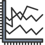
A line graph shows trends over time using connected data points.
Best for: Time-based data
Example: Website traffic growth
When to use:
- Tracking progress
- Identifying trends
Pros:
- Great for continuous data
- Shows trends clearly
Cons:
- Not ideal for categorical comparison
Histogram

A histogram displays data distribution using grouped intervals.
Best for: Frequency distribution
Example: Exam score ranges
When to use:
- Understanding data spread
- Identifying patterns
Pros:
- Shows distribution clearly
- Useful in statistics
Cons:
- Can be confusing for beginners
Scatter Plot

A scatter plot shows relationships between two variables.
Best for: Correlation analysis
Example: Height vs weight
When to use:
- Identifying patterns
- Detecting outliers
Pros:
- Reveals relationships
- Great for analysis
Cons:
- Needs interpretation
Area Chart
An area chart is similar to a line graph but filled with color.
Best for: Showing volume over time
Example: Revenue growth
Use case:
- Comparing multiple trends
Bubble Chart
A bubble chart adds a third dimension using bubble size.
Best for: Multi-variable comparison
Example: Sales, profit, and growth
Treemap Chart
Treemaps display hierarchical data using nested rectangles.
Best for: Complex structures
Example: Company departments
Box Plot (Box and Whisker)
Shows data distribution using quartiles.
Best for: Statistical analysis
Heatmap
A heatmap uses colors to represent data intensity.
Best for: Pattern recognition
Example: Website click tracking
Comparison Table of Graph Types
| Graph Type | Best For | Example Use |
|---|---|---|
| Bar Chart | Comparison | Product sales |
| Pie Chart | Proportions | Market share |
| Line Graph | Trends | Website traffic |
| Histogram | Distribution | Test scores |
| Scatter Plot | Correlation | Height vs weight |
How to Choose the Right Graph
Choosing the right graph depends on your goal:
Use a Bar Chart:
- When comparing categories
Use a Line Graph:
- When showing trends over time
Use a Pie Chart:
- When showing percentages
Use a Histogram:
- When analyzing data distribution
Use a Scatter Plot:
- When exploring relationships
Simple rule:
- Comparison → Bar Chart
- Trend → Line Graph
- Percentage → Pie Chart
- Distribution → Histogram
- Relationship → Scatter Plot
Best Tools to Create Graphs and Charts (Free & Online)
You can easily create graphs using online tools:
- Bar chart maker
- Pie chart generator
- Line graph creator
- Histogram tool
- Scatter plot tool
Common Mistakes to Avoid
Avoid these common errors:
- Using the wrong graph type
- Adding too much data
- Misleading axis scales
- Poor labeling
- Overcomplicated visuals
Real-Life Examples of Graph Usage
Graphs are used everywhere:
Business
- Sales reports
- Performance dashboards
Education
- Research projects
- Assignments
Marketing
- Campaign analysis
- User behavior
Finance
- Stock trends
- Budget analysis
FAQs
What are the main types of graphs and charts?
The main types of graphs and charts include bar charts, pie charts, line graphs, histograms, and scatter plots, each used for different data visualization purposes.
Which graph is best for comparison?
A bar chart is best for comparing values across categories because it clearly shows differences.
When should I use a pie chart?
Use a pie chart when you want to show proportions or percentages that add up to 100%.
What is the difference between histogram and bar chart?
A histogram shows data distribution in intervals, while a bar chart compares categorical data.
Which graph shows trends over time?
A line graph is the best choice for showing trends over time.
Conclusion
Understanding the different types of graphs and charts helps you present data more effectively and make better decisions. Each graph serves a unique purpose, and choosing the right one can make your data more impactful and easier to understand.
👉 Start using free tools today to create professional graphs and improve your data visualization skills.