
If you’ve ever looked at a spreadsheet full of numbers and felt overwhelmed, you’re not alone. Raw data can be difficult to understand, even for experienced professionals. That’s where learning how to visualize data becomes essential.
Data visualization transforms complex information into clear, visual formats like charts and graphs. It helps you quickly identify patterns, trends, and insights that would otherwise go unnoticed. Whether you’re working in business, marketing, education, or analytics, knowing how to visualize data effectively can dramatically improve how you communicate information.
In this guide, you’ll learn how to visualize data step-by-step, explore different chart types, see real-life examples, and discover the best tools to create powerful visuals.
What Is Data Visualization?
Data visualization is the process of representing data using visual elements such as charts, graphs, and maps to make information easier to understand.
Featured Snippet Definition:
Data visualization is the practice of presenting data in graphical formats like charts and graphs, allowing users to easily understand trends, patterns, and insights.
Why Data Visualization Matters
Understanding how to visualize data is important because:
- It simplifies complex information
- Helps identify trends and patterns
- Improves decision-making
- Enhances communication
- Saves time when analyzing data
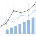
For example, a line graph can instantly show growth trends that would take minutes to interpret in raw numbers.
Types of Charts Used in Data Visualization
Before learning the process, it’s important to understand the most common chart types.
Bar Chart
Best for comparing categories.
Example: Comparing sales of different products.
Line Graph

Best for showing trends over time.
Example: Website traffic growth over months.
Pie Chart
Best for showing percentages.
Example: Market share distribution.
Histogram
Best for showing data distribution.
Example: Exam score ranges.
Scatter Plot
Best for showing relationships.
Example: Advertising spend vs revenue.
How to Visualize Data (Step-by-Step Guide)
This is the most important section. Follow these steps to master how to visualize data effectively.
Step 1: Understand Your Data
Start by analyzing your data:
- Is it numerical or categorical?
- Is it clean and organized?
- Are there missing values?
Step 2: Define Your Goal
Ask yourself:
- What do I want to show?
- Comparison
- Trend
- Distribution
- Relationship
Your goal determines the type of chart you should use.
Step 3: Choose the Right Chart
Match your goal with a chart:
- Comparison → Bar chart
- Trend → Line graph
- Percentage → Pie chart
- Distribution → Histogram
- Relationship → Scatter plot
Choosing the wrong chart can confuse your audience.
Step 4: Design for Clarity
Keep your visualization simple and clear:
- Use clear labels
- Avoid too many colors
- Keep layout clean
- Highlight important data
Simplicity = better understanding.
Step 5: Add Context and Insights
Don’t just show data, explain it:
- Add titles and captions
- Highlight key insights
- Explain what the data means
This turns charts into stories.
Step 6: Use the Right Tools
Use tools to create professional visuals easily (covered below).
Best Tools to Visualize Data (Free & Paid)
Choosing the right tool makes data visualization easier and faster.
Free Tools
- Online chart makers
- Spreadsheet tools like Excel or Google Sheets
- Basic visualization platforms
Advanced Tools
- Business intelligence tools (for dashboards)
- Data analytics platforms
- Visualization software
You can also:
- Create charts online without signup
- Use free graph makers for quick visuals
Real-Life Data Visualization Examples
Understanding how to visualize data becomes easier with real-world use cases.
Business Example
A company uses:
- Bar charts to compare product sales
- Line graphs to track revenue growth
Result: Better decision-making and strategy planning
Marketing Example


Marketers use:
- Pie charts for audience segmentation
- Line graphs for campaign performance
Result: Improved marketing ROI
Education Example
Teachers use:
- Bar charts for student performance
- Histograms for score distribution
Result: Easier understanding of student progress
Finance Example
Financial analysts use:
- Line graphs for stock trends
- Scatter plots for risk analysis
Result: Smarter investment decisions
Data Visualization Best Practices
Follow these best practices to improve your visuals:
- Keep charts simple
- Use consistent colors
- Label everything clearly
- Focus on key insights
- Use the right chart type
Common Mistakes to Avoid
Avoid these common errors:
- Using the wrong chart type
- Overloading with too much data
- Misleading axis scales
- Poor labeling
- Ignoring audience needs
Quick Chart Selection Guide
| Goal | Best Chart |
|---|---|
| Comparison | Bar Chart |
| Trend | Line Graph |
| Percentage | Pie Chart |
| Distribution | Histogram |
| Relationship | Scatter Plot |
FAQs
How do you visualize data step by step?
To visualize data, understand your data, define your goal, choose the right chart, design clearly, and add insights using visualization tools.
What is the best way to visualize data?
The best way depends on your goal. Bar charts are best for comparison, line graphs for trends, and pie charts for percentages.
Which tools are best for data visualization?
Popular tools include Excel, Google Sheets, and advanced analytics platforms for creating charts and dashboards.
What chart should I use for comparison?
A bar chart is the best option for comparing different categories.
Why is data visualization important?
It helps simplify complex data, identify patterns, and improve decision-making.
Conclusion
Learning how to visualize data is a valuable skill in today’s data-driven world. By choosing the right charts, following a clear step-by-step process, and using the right tools, you can turn raw data into meaningful insights.
Whether you’re a student, marketer, or business professional, mastering data visualization will help you communicate more effectively and make smarter decisions.
Start visualizing your data today using simple tools and clear charts.